## Menu Settings

Product: Monogram - Personal Portfolio WordPress Theme
URL: https://hub.jkdevstudio.com/docs/monogram/customization/menu-settings
Updated: 2026-04-14
Summary: Menu Settings
Monogram uses a custom navigation system with advanced features like megamenus, contact blocks, icons, and badge labels — all configured through WordPress menus and ACF fields.
Menu Loca

# Menu Settings

Monogram uses a custom navigation system with advanced features like megamenus, contact blocks, icons, and badge labels - all configured through WordPress menus and ACF fields.

## Menu Location

The theme registers one menu location: **Navigation Menu** (`primary_menu`). Assign your menu in **Appearance &gt; Menus** or **Appearance &gt; Customize &gt; Menus**.

## Custom Walker

Monogram replaces the default WordPress menu walker with a custom one called JKDWalker that adds several features:

- **Maximum 7 top-level items** - If you add more than 7 top-level menu items, the overflow items are automatically grouped into a "More" dropdown. All children of overflow items are preserved at full depth.
- **Megamenu support** - Any top-level item with children can be turned into a full-width megamenu.
- **Contact submenu** - Embed contact details and a Google Map directly inside a dropdown.
- **Icon support** - Add an SVG or image icon next to any menu item.
- **Badge labels** - Attach a small highlighted tag like "New", "Hot", or "Sale" to any item.
- **Post count display** - Show the number of published posts next to archive menu items.
- **Disabled state** - Visually disable a menu item (dims it and removes click behavior).
- **Mobile back button** - Automatically injects a back button in mobile submenus.

## Per-Item ACF Fields

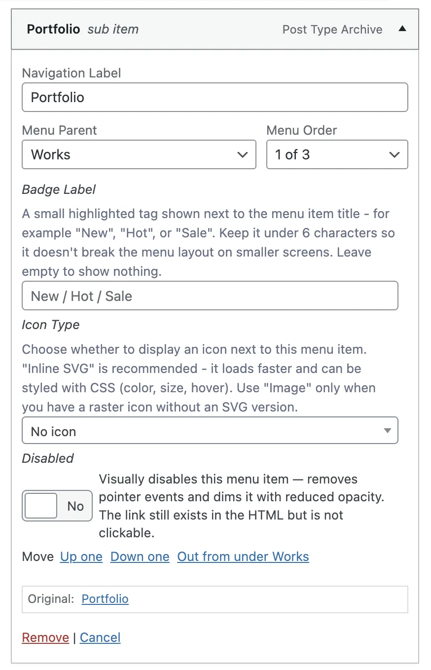
Every menu item gets a set of custom fields powered by Advanced Custom Fields. You can find these fields when editing any menu item in **Appearance &gt; Menus**.

<figure class="doc-figure" data-width="50%" data-align="left" style="max-width: 50%; width: 100%; margin-left: 0px; margin-right: auto;"><img src="https://hub.jkdevstudio.com/storage/docs/2026/04/74923a3a-5e96-43d7-bdbe-09b9d585e0d4.webp" alt="" class="doc-image rounded-xl max-w-full"></figure>

### Badge Label

<table style="min-width: 75px;"><colgroup><col style="min-width: 25px;"><col style="min-width: 25px;"><col style="min-width: 25px;"></colgroup><tbody><tr><th colspan="1" rowspan="1"><p>Field</p></th><th colspan="1" rowspan="1"><p>Type</p></th><th colspan="1" rowspan="1"><p>Description</p></th></tr><tr><td colspan="1" rowspan="1"><p><strong>Badge Label</strong></p></td><td colspan="1" rowspan="1"><p>Text</p></td><td colspan="1" rowspan="1"><p>A small highlighted tag shown next to the menu item title. Examples: New, Hot, Sale. Keep it under 6 characters. Leave empty to show nothing.</p></td></tr></tbody></table>

### Icons

<table style="min-width: 75px;"><colgroup><col style="min-width: 25px;"><col style="min-width: 25px;"><col style="min-width: 25px;"></colgroup><tbody><tr><th colspan="1" rowspan="1"><p>Field</p></th><th colspan="1" rowspan="1"><p>Type</p></th><th colspan="1" rowspan="1"><p>Description</p></th></tr><tr><td colspan="1" rowspan="1"><p><strong>Icon Type</strong></p></td><td colspan="1" rowspan="1"><p>Select</p></td><td colspan="1" rowspan="1"><p>Choose No icon, Inline SVG (recommended), or Image (PNG, WebP)</p></td></tr><tr><td colspan="1" rowspan="1"><p><strong>SVG Code</strong></p></td><td colspan="1" rowspan="1"><p>Textarea</p></td><td colspan="1" rowspan="1"><p>Paste raw SVG code. Remove width/height attributes so it scales correctly. Only shown when Icon Type is Inline SVG</p></td></tr><tr><td colspan="1" rowspan="1"><p><strong>Icon Image</strong></p></td><td colspan="1" rowspan="1"><p>Image</p></td><td colspan="1" rowspan="1"><p>Upload a small icon (24x24px or 32x32px recommended). Only shown when Icon Type is Image</p></td></tr></tbody></table>

### Megamenu

<table style="min-width: 75px;"><colgroup><col style="min-width: 25px;"><col style="min-width: 25px;"><col style="min-width: 25px;"></colgroup><tbody><tr><th colspan="1" rowspan="1"><p>Field</p></th><th colspan="1" rowspan="1"><p>Type</p></th><th colspan="1" rowspan="1"><p>Description</p></th></tr><tr><td colspan="1" rowspan="1"><p><strong>Enable Megamenu</strong></p></td><td colspan="1" rowspan="1"><p>Toggle</p></td><td colspan="1" rowspan="1"><p>Turns this items dropdown into a full-width megamenu with columns and banners. Only use for top-level items that have child links</p></td></tr><tr><td colspan="1" rowspan="1"><p><strong>Show Banner</strong></p></td><td colspan="1" rowspan="1"><p>Toggle</p></td><td colspan="1" rowspan="1"><p>Adds a visual banner block on the side of the megamenu</p></td></tr><tr><td colspan="1" rowspan="1"><p><strong>Banner Image</strong></p></td><td colspan="1" rowspan="1"><p>Image</p></td><td colspan="1" rowspan="1"><p>The image displayed in the megamenu banner. Recommended minimum width: 600px</p></td></tr><tr><td colspan="1" rowspan="1"><p><strong>Banner Click URL</strong></p></td><td colspan="1" rowspan="1"><p>URL</p></td><td colspan="1" rowspan="1"><p>Where the banner links when clicked. Leave empty for decorative-only banners</p></td></tr><tr><td colspan="1" rowspan="1"><p><strong>Banner Alt Text</strong></p></td><td colspan="1" rowspan="1"><p>Text</p></td><td colspan="1" rowspan="1"><p>Description of the banner image for screen readers and SEO</p></td></tr></tbody></table>

<div data-callout="tip">

The megamenu displays child menu items as columns. Organize your child items into logical groups for the best layout.

</div>

### Contact Block

<table style="min-width: 75px;"><colgroup><col style="min-width: 25px;"><col style="min-width: 25px;"><col style="min-width: 25px;"></colgroup><tbody><tr><th colspan="1" rowspan="1"><p>Field</p></th><th colspan="1" rowspan="1"><p>Type</p></th><th colspan="1" rowspan="1"><p>Description</p></th></tr><tr><td colspan="1" rowspan="1"><p><strong>Show Contact Block</strong></p></td><td colspan="1" rowspan="1"><p>Toggle</p></td><td colspan="1" rowspan="1"><p>Adds a contact section directly inside this items dropdown menu</p></td></tr><tr><td colspan="1" rowspan="1"><p><strong>Title</strong></p></td><td colspan="1" rowspan="1"><p>Text</p></td><td colspan="1" rowspan="1"><p>Heading at the top of the contact block</p></td></tr><tr><td colspan="1" rowspan="1"><p><strong>Subtitle</strong></p></td><td colspan="1" rowspan="1"><p>Text</p></td><td colspan="1" rowspan="1"><p>Supporting line below the title</p></td></tr><tr><td colspan="1" rowspan="1"><p><strong>Contact Entries</strong></p></td><td colspan="1" rowspan="1"><p>Repeater</p></td><td colspan="1" rowspan="1"><p>Add individual contact details (see sub-fields below)</p></td></tr></tbody></table>

Each contact entry contains:

<table style="min-width: 75px;"><colgroup><col style="min-width: 25px;"><col style="min-width: 25px;"><col style="min-width: 25px;"></colgroup><tbody><tr><th colspan="1" rowspan="1"><p>Sub-field</p></th><th colspan="1" rowspan="1"><p>Type</p></th><th colspan="1" rowspan="1"><p>Description</p></th></tr><tr><td colspan="1" rowspan="1"><p><strong>Label</strong></p></td><td colspan="1" rowspan="1"><p>Text</p></td><td colspan="1" rowspan="1"><p>Short identifier (e.g., Sales, Support)</p></td></tr><tr><td colspan="1" rowspan="1"><p><strong>Icon Name</strong></p></td><td colspan="1" rowspan="1"><p>Text</p></td><td colspan="1" rowspan="1"><p>Icon identifier (e.g., mail, phone, map-pin)</p></td></tr><tr><td colspan="1" rowspan="1"><p><strong>Description</strong></p></td><td colspan="1" rowspan="1"><p>Textarea</p></td><td colspan="1" rowspan="1"><p>Optional supporting text below the value</p></td></tr><tr><td colspan="1" rowspan="1"><p><strong>Display Value</strong></p></td><td colspan="1" rowspan="1"><p>Text</p></td><td colspan="1" rowspan="1"><p>The visible text shown to visitors</p></td></tr><tr><td colspan="1" rowspan="1"><p><strong>Link</strong></p></td><td colspan="1" rowspan="1"><p>Text</p></td><td colspan="1" rowspan="1"><p>Use mailto: for emails, tel: for phone numbers, or a URL</p></td></tr></tbody></table>

<table style="min-width: 75px;"><colgroup><col style="min-width: 25px;"><col style="min-width: 25px;"><col style="min-width: 25px;"></colgroup><tbody><tr><th colspan="1" rowspan="1"><p>Field</p></th><th colspan="1" rowspan="1"><p>Type</p></th><th colspan="1" rowspan="1"><p>Description</p></th></tr><tr><td colspan="1" rowspan="1"><p><strong>Office Location Map</strong></p></td><td colspan="1" rowspan="1"><p>Google Map</p></td><td colspan="1" rowspan="1"><p>Pin your office location. Renders a small embedded map inside the contact block</p></td></tr></tbody></table>

### Utility Fields

<table style="min-width: 75px;"><colgroup><col style="min-width: 25px;"><col style="min-width: 25px;"><col style="min-width: 25px;"></colgroup><tbody><tr><th colspan="1" rowspan="1"><p>Field</p></th><th colspan="1" rowspan="1"><p>Type</p></th><th colspan="1" rowspan="1"><p>Description</p></th></tr><tr><td colspan="1" rowspan="1"><p><strong>Show Post Count</strong></p></td><td colspan="1" rowspan="1"><p>Toggle</p></td><td colspan="1" rowspan="1"><p>Displays the number of published posts next to this menu item. Only works for category or taxonomy archive links</p></td></tr><tr><td colspan="1" rowspan="1"><p><strong>Disabled</strong></p></td><td colspan="1" rowspan="1"><p>Toggle</p></td><td colspan="1" rowspan="1"><p>Visually disables the menu item with reduced opacity and removes pointer events</p></td></tr></tbody></table>

<div data-callout="warning">

The Google Map field in the contact block requires a valid Google Maps API key. Add your key in Appearance &gt; Customize &gt; API Keys before using this feature.

</div>