## Global Settings
Product: Monogram - Personal Portfolio WordPress Theme
URL: https://hub.jkdevstudio.com/docs/monogram/elementor-builder/global-settings
Updated: 2026-09-10
Summary: What Monogram configures in Elementor during demo import, why widget colors follow the theme scheme, and the scroll attributes you can add to any section.
After installing Monogram and importing demo content, Elementor is auto-configured with optimal settings. Here is what the theme handles for you and what you can customize.
## Auto-configured settings
During demo import, Monogram automatically adjusts Elementor global configuration:
- **Default color schemes** are disabled, so Elementor inherits colors from the theme instead of applying its own palette. Colors are managed at [[Appearance > Customize > Color Scheme]].
- **Default typography schemes** are disabled. Typography is controlled at [[Appearance > Customize > Typography]].
- **Font display** is set to `swap` for better loading performance.
- **CSS print method** is set to external file, which is also the Elementor default. Page transitions depend on it, see below.
- **Elementor kit** is synced from the demo data to match the theme design system.
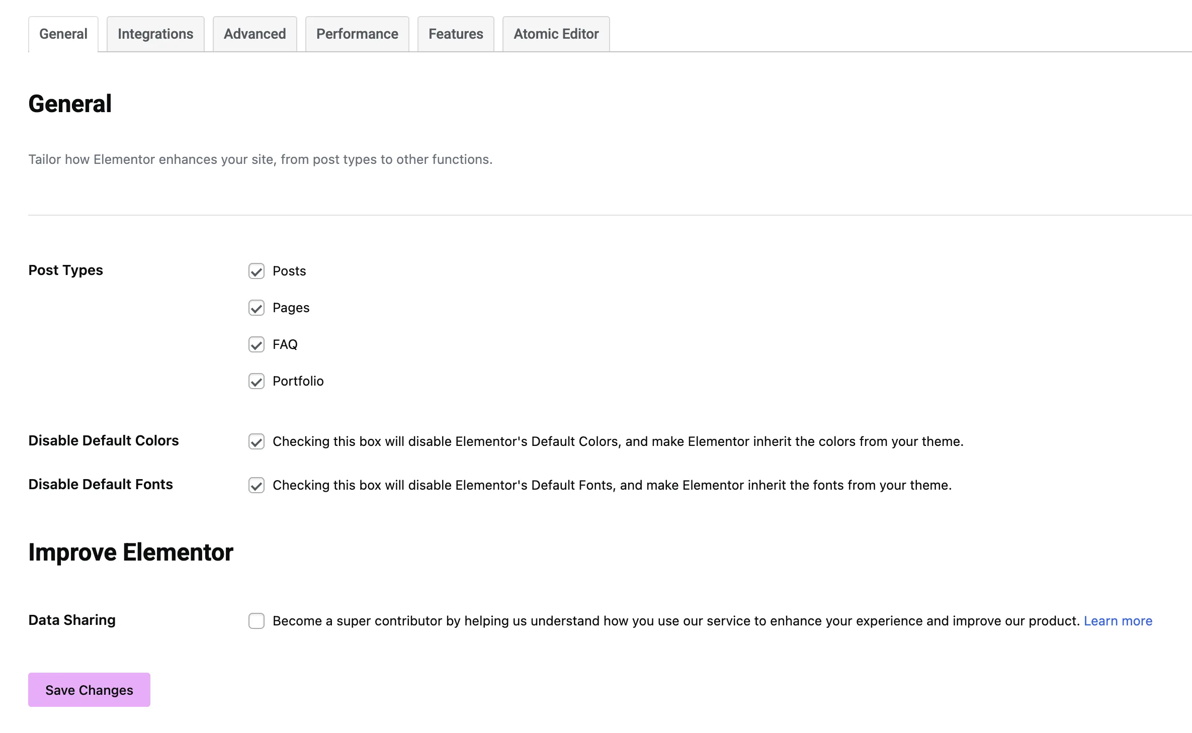
You do not need to configure Elementor color or typography settings manually. The theme Customizer handles all global styling.
## Keep CSS print method on external file
At [[Elementor > Settings > Performance]], leave **CSS print method** on **External file**. Do not switch it to Internal embedding.
Each page you build gets its own CSS file. Page transitions swap the page content in place and carry those files across with it. Set to Internal embedding, that CSS is printed as a style block inside the page instead, and a style block travels with the page it belongs to: the new page arrives with its own set, the previous set is still sitting in the document, and you get a mixture of the two until a full browser reload clears it. The usual symptom is a page that looks broken until you hard refresh it.
Caching and optimization plugins can produce the same result from the other direction. Combine CSS, remove unused CSS, and critical CSS options merge or rename the per-page file, so there is nothing left for the theme to carry across. If a page only renders correctly after a hard refresh, turn those off first and clear the cache.
The checklist below covers this setting and four others worth one pass.
Elementor settings to configure once
## Widget colors follow the theme, not Elementor
Every Elementor widget takes its color from the active dark or light scheme, with no setting to switch on. A widget only stops following the scheme when a color has been set on it by hand, either in the widget color field or by Elementor default palette being switched back on.
If a widget is stuck on one color across both modes, the fixes are in [Color Scheme](https://hub.jkdevstudio.com/docs/monogram/customization/color-scheme), which also covers how to give a section a fixed appearance on purpose.
## Custom data attributes
Monogram adds custom attributes you can use on any Elementor section or column for scroll-based effects. Add these via [[Advanced > Attributes]] in the Elementor editor.
### Background parallax
| Attribute | Value | Description |
data-jkd-parallax | (no value needed) | Enables parallax on the section background image |
data-parallax-strength | Number (default: 20) | Controls parallax intensity. Higher values create more movement |
The parallax effect uses GSAP ScrollTrigger with `scrub: 0.6` for smooth, damped motion.
### Scroll transform
| Attribute | Value | Description |
data-jkd-scroll | (no value needed) | Enables scroll-based Y transformation |
data-scroll-y | Pixels (e.g. 100) | How far the element moves vertically on scroll |
data-scroll-scrub | Number (default: 0.6) | Animation damping. Lower values follow scroll more tightly |
data-scroll-start | ScrollTrigger value | When the animation starts (e.g. top bottom) |
data-scroll-end | ScrollTrigger value | When the animation ends (e.g. bottom top) |
## Widget category
All Monogram widgets appear under the **jkd-widgets** category in the Elementor widget panel. Search for "jkd" to quickly find them.
## Elementor editor compatibility
Several theme features are automatically disabled inside the Elementor editor to prevent conflicts:
- **Smooth scroll** - disabled to allow normal editor scrolling
- **Custom cursor** - disabled to keep the standard editor cursor
- **Barba.js page transitions** - disabled since the editor handles its own navigation
These features activate normally on the frontend when visitors browse your site.