
Start with the thing almost everybody trips over. It is standard WordPress rather than anything about our themes, and getting it wrong costs an afternoon.
#Front page, homepage, posts page
These three words get used interchangeably, and they are not the same thing.
- The homepage
What a visitor sees at your domain root. It describes a destination; there is no setting called homepage.
- The front page
The WordPress setting that decides what fills that root. It is either your latest posts, or one specific static page you nominate.
- The posts page
Only exists if you chose a static front page. It is the second page you nominate to carry the blog feed, and it is what the theme's listing settings configure.
Both are assigned at SettingsReading, and the WordPress documentation covers the setting itself.
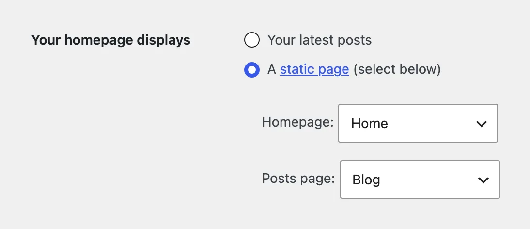
If you are configuring the feed and nothing changes, you are editing the wrong page.
This is the most common cause of "my settings do nothing". Decide the arrangement before you build anything, because switching later means redoing the work.
A nominated posts page loses its own content, and the blog listing moves to its address.
WordPress ignores whatever you wrote on the page you assign as the posts page and prints the feed there instead, so never point it at a page that has content you want. The listing of your latest posts now lives at that page's URL, for example /blog/, and the domain root shows the static front page. Individual post URLs keep their permalink structure. On a site with traffic, check where visitors and old links to the listing now land.
#How to build one
Our themes are built on JKD Toolkit and the block editor, and the split is the same in all of them.
- The Customizer, with the free or base edition
The fastest route and the least obvious one. The posts page takes a featured zone at the top, the listing in the style you want, a sidebar and a call to action. That is a complete homepage assembled with the free tools, with no page building involved.
- The block editor, for a static front page
When the homepage should be its own page composed from blocks. This is the route that gives you arbitrary sections in an arbitrary order.
- Pro features on top of either
Some sections and listing modes live in the Pro plugin and need an active license. The theme tells you which, and nothing disappears without one.
Take the simplest route that produces the result you want.
#Do not start from an empty page
The fastest way to a good homepage is to take the demo homepage and rework it.
The second fastest is to copy the sections you like from a demo and assemble your own from those.
There is nothing wrong with either. Demos exist for exactly this.
#What separates a composed homepage from a pile
Six things, cheap to get right and expensive to fix later. None of them is specific to a theme.
Consistent spacing between sections. The most visible difference between a careful page and a hurried one, and the easiest to correct.
One heading hierarchy. Section titles at the same level and the same size throughout. Different sizes in neighboring sections read as a mistake even when each looks fine alone.
No more than two or three accents. If everything is emphasized, nothing is.
No item appearing twice. Two listings drawing from the same source need an offset to separate them.
Rhythm rather than uniformity. Several sections in a row with the same grid read as one long section. Alternate the density.
The first screen. A reader should understand what the site is about within a second. That is the first section's job, not the footer's.
#Keep the first screen light
The top of the page is where homepages get slow.
The first thing a visitor sees also decides how fast the page feels. A full width video, a slider with eight slides, or a large uncompressed image at the top all delay the moment the page becomes readable, and search engines measure exactly that moment.
A still image, sized correctly and served in a modern format, is almost always the better trade. If you want motion, put it below the fold where it loads after the page is usable.
#Check the result
Check it on mobile separately. A homepage is the longest page on the site, and on a phone it is twice as long again.
Also check that the homepage leads into sections, not only into individual items. A homepage that offers no route deeper is a dead end with good typography.
#Common questions
Should my homepage be the feed or a separate page?
A feed if publishing frequency is the point, and a separate page if you want to present sections, featured material and a message before the feed begins.
My homepage settings do nothing
You are editing the wrong page. SettingsReading tells you which page is the front page and which is the posts page, and the theme's listing settings apply to the second one.
I set a posts page and my blog listing moved
That is the expected behavior: the listing now lives at the posts page's address, and the root shows your static front page. Individual post URLs do not change. On a site with traffic, update menu links and any links that pointed at the old listing.
The page I chose as the posts page shows nothing I wrote
Also expected. WordPress replaces its content with the feed, so nominate an empty page and keep your content somewhere else.
How many sections should a homepage have?
As many as have something to say. Six sections with a purpose beat twelve that fill space.
It looks fine and feels wrong
Look at spacing and heading sizes first. Those two account for most of the difference between a page that feels designed and one that does not.
#Still stuck
Open a support ticket and say what you tried and where it stopped. Your product, your domain, a screenshot and the exact message you saw are usually enough to settle it in one reply.
Last updated