
Colors, fonts and style variations - Grafton
Every color, font, size and spacing value in Grafton lives in Styles, at AppearanceEditorStyles. Change one there and every page and block that uses it follows, Grafton Pro's sections included. How Styles works in general is in colors and fonts in a block theme.
#Seven colors, each with one job
The page background and the text on dark buttons.
Light grey bands, such as the home page hero and the page header.
Headings, dark buttons and the footer band.
Leads under titles and meta text.
Body text.
Hairlines, pill frames and field frames.
The brand orange: section labels, link underlines on hover, button hover.
Change a color by its role, not by finding every block that uses it: setting Primary to your brand color recolors labels, hovers and the subscribe button at once.
#The font comes from the WordPress Font Library
Grafton uses Funnel Display for headings and body text. The theme ships no font files: it names the family, and the font itself is installed in the WordPress Font Library at AppearanceFonts, where you can see it, replace it or add others.
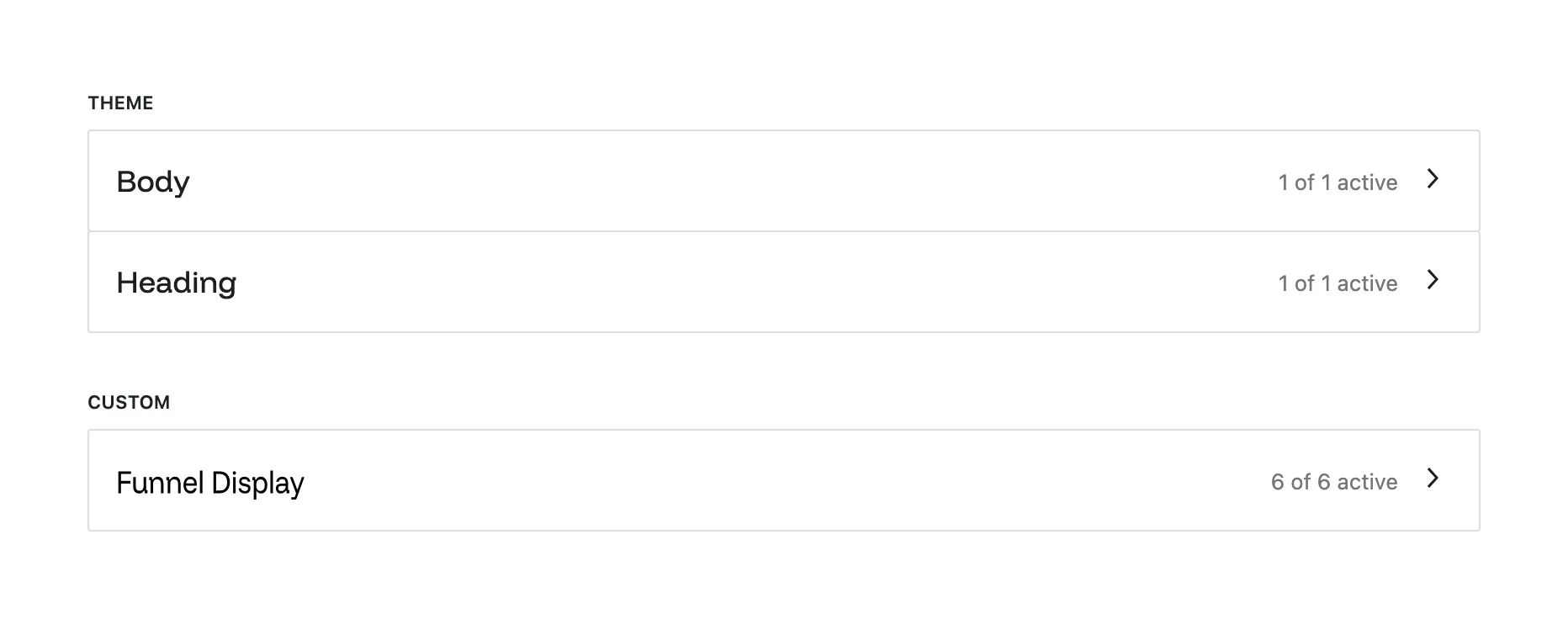
Install Funnel Display
On a fresh site, open AppearanceFonts, go to Install Fonts, find Funnel Display in the Google Fonts collection and install it. The demo import does this for you.
Use another font if you prefer
Install or upload the font on the same screen, then pick it for Text and Headings in AppearanceEditorStylesTypography.
Until a font is installed, text shows in your device's system font. Nothing breaks; it only looks plainer.
#Sizes and spacing scale with the screen
Text sizes run from Small (13px) and Meta (14px) through Base (16px) up to Display, which grows to 108px on a wide screen. The large sizes shrink smoothly on a phone, so a heading never needs a separate mobile size. Spacing presets are named by their width in pixels (8px, 24px, 40px), and the three largest (60px, 80px and 120px) shrink on small screens.
#Ink and Paper: two more color sets
Grafton has two style variations next to the default white one. Switch in AppearanceEditorStylesBrowse styles.
- Ink
A dark site: near-black background, light text and a slightly brighter orange. The logo turns white automatically.
- Paper
A warm off-white background with brown-black text and a burnt orange accent, for a quieter reading feel.
Both change the seven colors only. Fonts, sizes and spacing are the same in all three looks.
Last updated
Was this article helpful?

On this page