
Preloader & Placeholders
Configure what visitors see while images are still loading. A good combination of preloader and background color makes the experience feel polished even on slow connections.

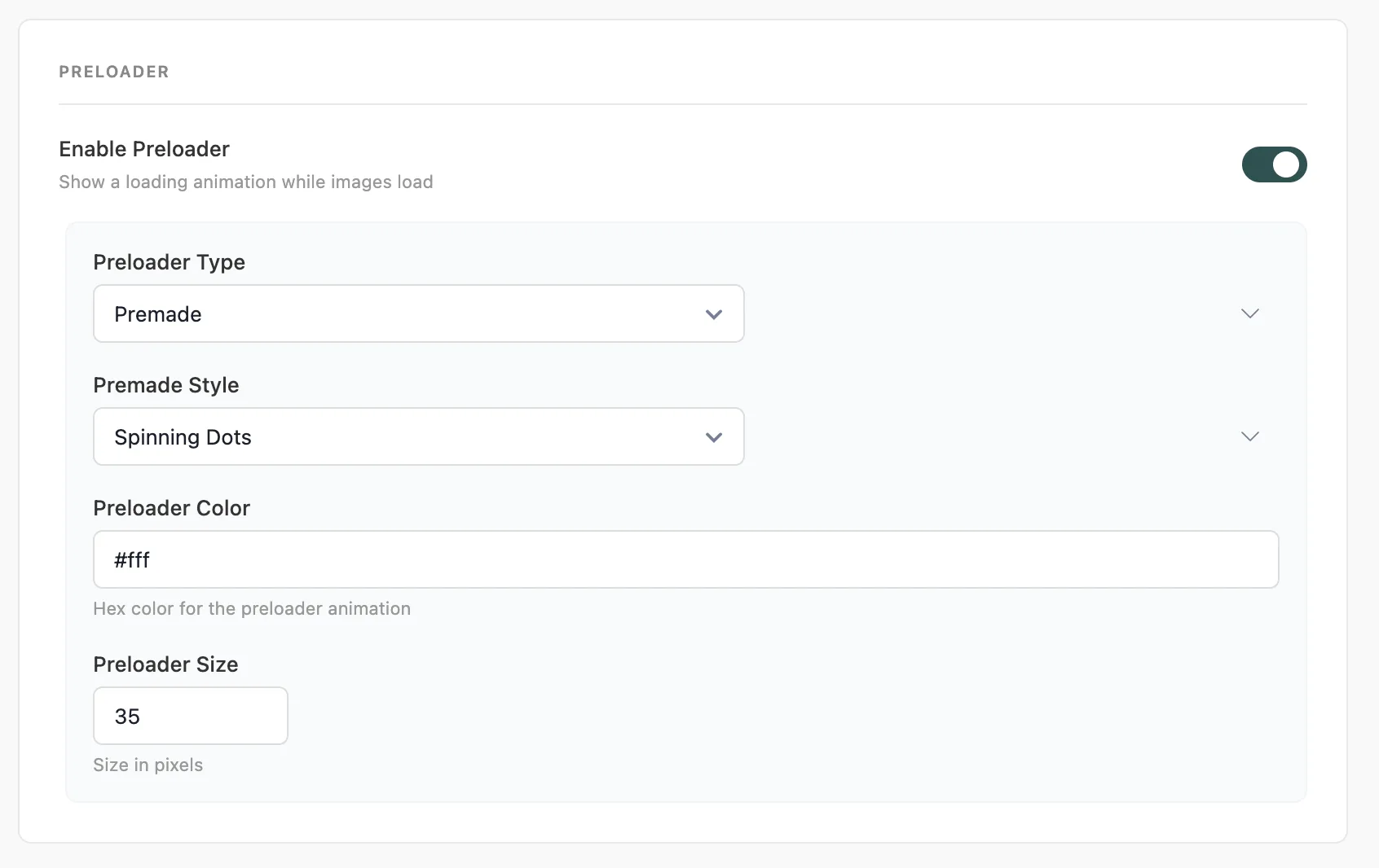
#Preloader Animation
Setting | Description |
|---|---|
Enable Preloader | Show a loading animation centered on each image while it loads |
Preloader Type | Premade - choose from built-in SVG animations. Custom SVG - paste your own SVG code |
Premade Style | Select from available preloader animations (e.g. |
Preloader Color | Color for the animation, applied via CSS custom property |
Preloader Size | Size in pixels. Default: |
The preloader fades out automatically once the image finishes loading or encounters an error.
The preloader color should contrast with your background. Use white or a light accent for dark backgrounds; use your brand color or a mid-tone for light backgrounds.
#Background & Fallback
Setting | Description |
|---|---|
Background Color Toggle | Show a solid background color behind images while they load |
Background Color | Hex color value. Default: |
Fallback Image | URL shown if the original image fails to load |
Placeholder Image | Default placeholder used as |
The Background Color fills the space before any LQIP placeholder appears. If you're using LQIP, this is only visible for a few milliseconds. Set it close to your LQIP dominant color for a seamless transition.
#Exclude Rules
Setting | Description |
|---|---|
Ignore IDs | HTML element IDs to skip. One per line. Example: |
Ignore Classes | CSS class names to skip. Space-separated. Example: |
Always add your hero or banner image to Ignore IDs or Ignore Classes. Loading your LCP element eagerly (not lazy) is the single most impactful thing you can do for your Largest Contentful Paint score.
Last updated
Was this article helpful?

On this page