
Navigation & Footer
The header and footer frame every page of your site. Monogram gives you granular control over both through the Customizer.
#Header & Navigation
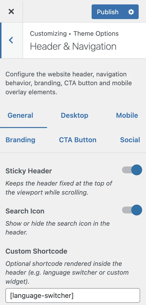
Open Appearance > Customize > Header & Navigation to configure the site header. Settings are organized into six tabs: General, Desktop, Mobile, Branding, CTA Button, and Social.
#General
Setting | Type | Default | Description |
|---|---|---|---|
Sticky Header | Toggle | On | Keeps the header fixed at the top of the viewport while scrolling |
Search Icon | Toggle | On | Shows or hides the search icon in the header |
Custom Shortcode | Text | - | Optional shortcode rendered inside the header (e.g., a language switcher) |
#Desktop Dimensions
Setting | Type | Default | Range | Description |
|---|---|---|---|---|
Navbar Height | Slider | 55px | 40–80px | Height of the desktop navigation bar |
Top Offset | Slider | 30px | 0–60px | Distance from the top of the viewport when not scrolled |
Scrolled Offset | Slider | 15px | 0–40px | Distance from the top when scrolled down. Set to 0 to pin the navbar flush at the top |
Inner Padding | Slider | 20px | 10–40px | Horizontal padding inside the navigation bar |
Link Spacing | Slider | 9px | 4–24px | Horizontal padding around each menu link |
Dropdown Width | Slider | 200px | 150–320px | Base width for submenu dropdowns and megamenu columns |
CTA Button Height | Slider | 35px | 28–50px | Height of the CTA button in the navigation bar |
#Mobile
Setting | Type | Default | Range | Description |
|---|---|---|---|---|
Navbar Height | Slider | 50px | 40–70px | Height of the mobile navigation bar |
Overlay Padding | Slider | 30px | 15–60px | Inner padding of the mobile navigation overlay |
Overlay Section Gap | Slider | 50px | 20–80px | Spacing between header, menu, and social sections in the overlay |
Menu Item Gap | Slider | 15px | 5–40px | Vertical spacing between menu items in the overlay |
Social Icon Size | Slider | 20px | 14–36px | Size of social media icons in the mobile overlay |
Social Icon Spacing | Slider | 20px | 8–40px | Gap between social media icons |
#Branding (Logos)
Monogram supports separate logos for desktop, mobile header, and mobile overlay - each with an optional light-scheme variant.
Setting | Type | Default | Description |
|---|---|---|---|
Use Fallback Logos | Toggle | On | Shows built-in theme logos when custom logos are not set |
Show Desktop Logo | Toggle | On | Show or hide the logo in the desktop header |
Logo (Desktop) | Image | - | Main site logo. SVG recommended |
Logo - Light Scheme (Desktop) | Image | - | Optional logo for light color scheme. Falls back to default logo if empty |
Logo Width (Desktop) | Slider | 100px | Controls the visual width of the desktop logo (50–260px) |
Show Mobile Logo | Toggle | On | Show or hide the logo in the mobile header |
Logo (Mobile) | Image | - | Logo used in the mobile header. SVG recommended |
Logo - Light Scheme (Mobile) | Image | - | Optional mobile logo for light color scheme |
Logo Width (Mobile) | Slider | 50px | Visual width of the mobile logo (25–260px) |
Show Mobile Overlay Logo | Toggle | On | Show or hide the logo inside the mobile overlay navigation |
Logo (Mobile Overlay) | Image | - | Logo displayed inside the mobile navigation overlay |
Logo - Light Scheme (Mobile Overlay) | Image | - | Optional overlay logo for light color scheme |
Logo Width (Mobile Overlay) | Slider | 75px | Logo size inside the mobile overlay (25–260px) |
Upload SVG logos for the sharpest results at any screen size. If you provide both a default and a light-scheme logo, the theme automatically swaps them when visitors toggle between dark and light mode.
#CTA Button
Setting | Type | Default | Description |
|---|---|---|---|
Enable CTA Button | Toggle | On | Displays a call-to-action button in the header |
CTA Label | Text | "Contact Me" | Text inside the button |
CTA URL | URL | - | Destination URL for the button |
Enable CTA Icon | Toggle | Off | Adds an icon inside the CTA button |
CTA Icon | Text | - | Iconoir icon name (e.g., "send", "arrow-right") |
CTA Icon Position | Select | Before text | Whether the icon appears before or after the button text |
#Social (Mobile Overlay)
Setting | Type | Default | Description |
|---|---|---|---|
Enable Social Icons | Toggle | On | Displays social media icons inside the mobile navigation overlay |
Social Links | Repeater | - | Add social profiles. Each entry has: Label (screen reader text), URL (profile link), Icon (uploaded image, SVG recommended), Icon CSS Class (optional, for font-based icon sets) |
#Footer
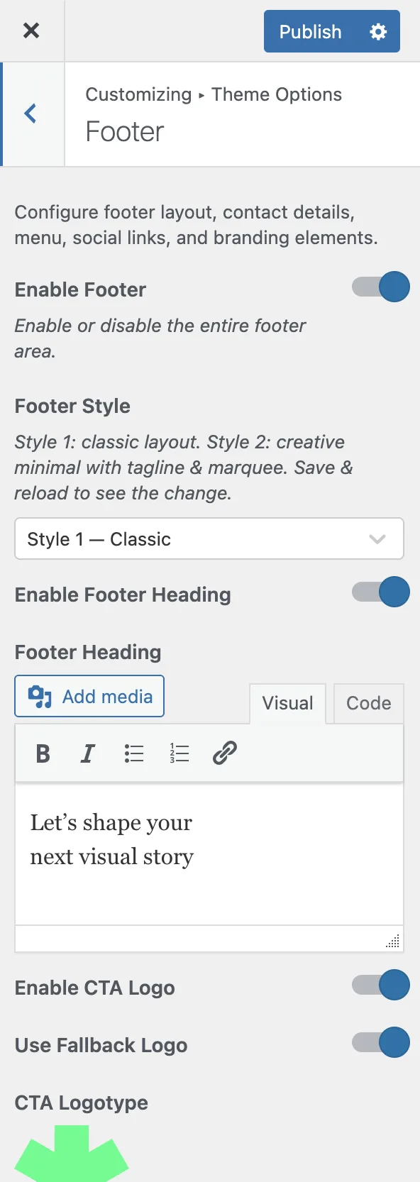
Open Appearance > Customize > Footer to configure the site footer. Monogram offers two footer styles.
#General
Setting | Type | Default | Description |
|---|---|---|---|
Enable Footer | Toggle | On | Enable or disable the entire footer area |
Footer Style | Select | Style 1 - Classic | Choose between Style 1 (Classic) with full content sections or Style 2 (Creative Minimal) with a tagline and compact layout |
Before Footer Template | Select | None | Choose an Elementor template to display above the footer (e.g., a CTA section). Only available when Elementor is active |
#Style 1 - Classic
The classic footer provides a rich layout with headings, contact info, social links, menus, and copyright.
Heading Section:
Setting | Type | Default | Description |
|---|---|---|---|
Enable Footer Heading | Toggle | On | Show a large heading area at the top of the footer |
Footer Heading | Editor | - | Rich text heading content (supports HTML) |
Enable CTA Logo | Toggle | On | Show a clickable logo/logotype in the heading area |
CTA Logotype | Image | - | The logo image displayed in the footer heading |
CTA Link URL | URL | - | Where the logo links to when clicked |
Contacts:
Setting | Type | Default | Description |
|---|---|---|---|
Enable Contacts Block | Toggle | On | Show the contact information section |
Enable Email | Toggle | On | Display email address |
Email Address | Text | Your contact email | |
Enable Phone | Toggle | On | Display phone number |
Phone Number | Text | +00 000 000 000 | Your contact phone number |
Call Button Label | Text | "Book Now" | Label for the phone call-to-action button |
Social & Menus:
Setting | Type | Default | Description |
|---|---|---|---|
Enable Social Icons | Toggle | On | Show social media links in the footer |
Social Links | Repeater | - | Same format as navigation social links (label, URL, icon, CSS class) |
Menu #1–#4 Column Label | Text | - | Heading label for each footer menu column |
Footer Menu #1–#4 | Select | None | Choose a WordPress menu to display in each column |
Copyright:
Setting | Type | Default | Description |
|---|---|---|---|
Enable Copyright Line | Toggle | On | Show the copyright bar at the bottom |
Copyright Text | Editor | © {year} Monogram, Inc. All rights reserved. | Supports HTML. Use |
#Style 2 - Creative Minimal
A compact, modern footer with a large tagline, contact details, and an availability indicator.
Setting | Type | Default | Description |
|---|---|---|---|
Tagline | Textarea | "Built with intention." | Large display text at the top of the footer |
Text | Contact email address | ||
Phone | Text | +00 000 000 000 | Contact phone number |
Location | Text | Kyiv, Ukraine | Your location or office city |
Availability Status | Text | "Available for freelance" | Shown with a blinking dot indicator |
Enable Social Icons | Toggle | On | Show social media links |
Social Links | Repeater | - | Same format as other social link repeaters |
Copyright Text | Editor | © {year} All rights reserved. | Supports HTML and |
The {year} placeholder in copyright text automatically updates to the current year, so you never need to edit it manually.
Last updated
Was this article helpful?

Resources
On this page